In today’s digital products, one of the most critical foundations for building scalable, consistent, and accessible experiences is the design system. A well-constructed design system accelerates not only designers but also product managers, developers, and even marketing teams.
So, what should you actually focus on to build an effective design system?
In this article, we will cover all the core elements of a design system—scientific typographic principles, color accessibility standards, component architecture, token management, and more.
1. What Is a Design System?
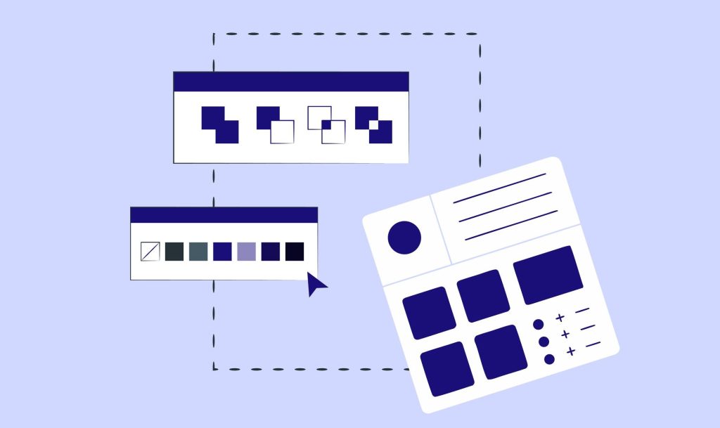
A design system is a collection of rules, components, documentation, and processes that ensure a product is designed in a consistent, reusable, and sustainable way.
It includes:
- Design tokens (color, spacing, radius, typography, elevation)
- Component library
- Usage guidelines
- Patterns and interaction rules
- Accessibility standards (WCAG)
- Code structure and implementation notes
To align with Google’s “Helpful Content” algorithm, the definition must be clear, practical, and connected to real use cases.
2. Before You Start: Research, Audit, and UI Inventory
The first step to building an effective design system is analyzing inconsistencies in the existing interface.
Why is this important?
According to Nielsen Norman Group, inconsistencies increase cognitive load and can reduce conversions by up to 15%.
What you should do:
- Create an inventory of all UI elements (buttons, colors, fonts, spacing).
- Identify visuals that serve the same purpose but look different.
- Document inconsistencies.
- Detect repeated patterns.
Main goal: Understand clearly why the system needs to exist.
3. Build the Design Tokens Correctly
The sustainability of a design system depends heavily on its design token architecture.
Token categories:
- Color tokens
- Font size & line-height tokens
- Spacing tokens
- Shadow & elevation
- Border radius
- Opacity
- State tokens (success, warning, error, info)
Scientific Technical Note
Using a modular scale (e.g., 1.125, 1.2, 1.333) improves typographic harmony.
This method is based on mathematical scales recommended by Tim Brown and Robert Bringhurst.
4. Color System: Contrast, Accessibility & WCAG Compliance
When building a color palette, accessibility standards are just as important as brand needs.
WCAG 2.2 contrast ratios:
- Normal text: 4.5:1
- Large text: 3:1
- UI elements: 3:1
What to consider:
- Define primary, secondary, neutral, and functional (error, warning, success, info) sets.
- Each color should have at least 8–12 tonal steps.
- Dark mode should be designed independently (not simply inverted).
This approach strengthens Google’s UX signals (Page Experience).
5. Typography: Hierarchy, Readability, and Scientific Foundation
Typography is a scientific discipline that directly influences user experience.
Line-height, character width, and line length shape user behavior.
Scientific rules:
- Optimal line length: 45–75 characters
- Line-height for body text: 1.4–1.6
- Heading hierarchy: no more than six levels
- Use performance-optimized web fonts (subsetting)
According to MIT (2020), readable typography allows users to complete tasks 20% faster.
6. Component Structure: Modular and Reusable
A true design system is not just a set of visual guidelines—it is a component-based architecture.
Key considerations:
- Every component must include a usage guideline.
- Components should include behavioral rules, not only visual.
- Edge-case scenarios should be documented.
- For developer handoff:
- Props list
- State variants
- API references
- Code snippets
Commonly used components:
- Buttons, Inputs, Modals, Dropdowns
- Alerts & Toasts
- Tabs
- Cards
- Navigation elements
7. Accessibility (A11Y): A Non-Negotiable Requirement
Modern design systems implement accessibility rules at the component level.
What to include:
- ARIA labels for each component
- Mandatory keyboard navigation (tab, space, enter)
- Designed focus-visible states
- Information must not rely solely on color
Google favors accessible websites in search rankings.
8. Documentation: As Important as the System Itself
The usability of a design system is determined by the quality of its documentation.
Good documentation includes:
- Clear and concise explanations
- Correct and incorrect usage examples
- Visual guidelines
- Figma + code integration
- Component variant samples
Well-structured content ranks higher on Google.
9. Versioning and Maintenance Process
A design system is not static; it evolves alongside the product.
What to maintain:
- Version control (SemVer)
- Changelogs
- Deprecated component management
- Feedback loops
- A shared rhythm between design and development teams
A system without maintenance collapses within six months.
10. Performance & Code Integration
A design system is not only about design—it is a technically integrated ecosystem.
Key technical points:
- Components should follow an atomic structure (atoms → molecules → organisms).
- CSS tokens should be implemented as variables (CSS Variables).
- Tree-shaking should remove unused components.
- Keep bundle size minimal.
High-performance systems improve UX and SEO simultaneously.
Conclusion: The Most Critical Elements of a Successful Design System
- Start with a detailed UI inventory
- Build a scientifically grounded token system
- Create accessible, contrast-optimized color palettes
- Base typography on readability research
- Design modular components with clear rules
- Make documentation a priority
- Plan long-term maintenance
A well-crafted design system increases design and development speed by at least 30%, strengthens user experience, and maintains long-term brand consistency.
 lavoradesignn.com
Yorum bırakın